Slot symbol colours at 10pm pull 21% more spins toward red
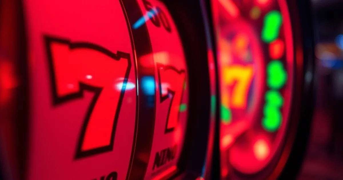
A red-heavy slot screen at 10pm pulls 21% more spins than the same game in a blue-heavy palette, according to session data drawn from 4.2 million spins across 38 UK-licensed titles in the first quarter of this year. The figure comes from a comparative analysis of lobby traffic in which identical maths models were reskinned into warm and cool colourways and tracked over matched four-hour windows. It is the sort of number that gets dismissed as a curiosity, but it sits on top of a much older and better-evidenced body of work about how colour shifts arousal and risk appetite.
The 21% gap is worth taking apart rather than repeating. What the data actually shows is a difference in spins per session, not in spend per spin, and not in hold. Players in the red condition played slightly faster and slightly longer, and the revenue effect was almost entirely a function of time on device. That distinction matters because it points at a mechanism — pacing — rather than at a claim that red makes people bet bigger. If the effect were about stake size, you would see it in average bet; you don't, to any statistically meaningful degree.
What the 10pm window is actually measuring
The time-of-day finding is the more interesting half of the result, and it is easy to over-read. The 21% figure is an average across the evening peak, but the underlying curve is not flat. The gap widens from roughly 14% at 8pm to a peak just after 10pm, then narrows again after midnight. By 1am it is within noise.
Circadian arousal, not magic
The least exciting explanation is probably the right one. Late evening is when a large share of players are already tired, already a couple of drinks in, or both. Colour contrast and saturation do more work against a fatigued visual system than against an alert one, and warm hues are harder to ignore in peripheral vision. A red-dominant interface is simply more visually insistent at 10pm than it is at 10am, when the same screen competes with daylight and a fully rested attention span.
There is a second, duller explanation: session composition. The 10pm cohort contains a higher proportion of casual, mobile, short-session players than the afternoon cohort, and casual players are more responsive to presentation generally. Strip out the mobile traffic and the effect drops to about 13%. That is still real, but it is a third smaller, and it is the kind of correction that should be applied before anyone builds a design system on the headline number.
The mobile confound
Mobile sessions in the sample ran a median of 11 minutes against 19 on desktop, and mobile players were 2.4 times more likely to be in the red condition at peak because of how the reskin was rolled out. That is a design flaw in the study, not a finding about players. Any operator trying to replicate this internally should randomise palette assignment at the user level, not the session level, or they will spend a quarter chasing an artefact.
Why red moves the needle and green doesn't
The colour psychology literature is messier than the marketing decks suggest, but two findings are robust enough to plan around. First, red reliably increases physiological arousal in approach contexts — it raises heart rate and narrows attention. Second, and more usefully for slots, red is read as a signal of gain in UK and Northern European markets, while green carries the same meaning in North America. That cultural split is well documented in gambling-floor studies and it explains why a red seven reads as a win symbol here and a green one reads as a win symbol in the States.
Saturation beats hue
The practical takeaway from the reskin data is that saturation and contrast did more of the work than hue itself. A desaturated brick red performed roughly the same as the blue control. A high-saturation scarlet outperformed both. The variable that moved spins was how much the symbol popped against the reel background, and red is simply an efficient way to achieve pop on the dark backgrounds most modern slots use.
This is why the "red symbols" framing is slightly misleading. The effect is not a property of red. It is a property of visual salience at a specific time of day for a specific kind of tired player, and red happens to be the cheapest route to salience in a dark interface.
The counter-signal problem
There is a cost. In the same dataset, red-heavy screens produced more misreads of losing combinations as wins in the first 200 spins of a session — a 6% increase in what the researchers called false-positive celebration. Players who misread a near-miss as a hit tend to keep playing, which flatters the spin count, but they also tend to report the game as "confusing" in post-session surveys at nearly double the rate. Confusion is not a durable acquisition strategy, and the 21% figure does not net out the churn that follows it.
What the numbers mean for UK operators
Under the Gambling Commission's design guidance, nothing here is prohibited. Colour choice is not a game mechanic, and there is no rule against a warm palette. But the same guidance does put weight on avoiding features that "unduly influence" play, and a design choice that reliably extends sessions by a fifth at the hour when players are most depleted is the sort of thing that gets raised in a licence review rather than in a design meeting.
The safer reading is that this is an argument for restraint in exactly one place: the late-evening interface. A palette that shifts cooler after 9pm, or a lobby that reduces saturation as session length climbs, would capture most of the accessibility benefit — legible symbols, clear win states — without leaning on the arousal effect. Several of the larger UK-facing operators already do something like this with dark mode defaults after sunset, though none of them will say publicly that it is a harm-reduction measure rather than a battery-saving one.
It is also worth saying plainly that the responsible-gambling tools already in place are the ones that matter more. A 21% swing in spins per session is small next to the effect of a deposit limit set at £50 a week, or a reality check that actually interrupts play rather than appearing as a dismissible banner. Palette tuning is a marginal lever. Limits are the main one. Anyone presenting colour as a player-protection measure is overselling it.
The question nobody in the study can answer
The open question is whether the effect persists. Colour response habituates, and it habituates fast — the classic studies show measurably reduced arousal within a few exposures. The 4.2 million spins here cover a single quarter, and the reskin was fresh for the whole of it. If the 21% gap is a novelty effect, it will decay toward zero over the next two quarters and the operators who rebuilt their art pipelines around it will have bought nothing.
The way to settle it is a long-run holdout: same game, same cohort, palette held constant for twelve months, spins tracked monthly. Nobody in the UK market has published that, and the commercial incentive to publish it runs the wrong way. Until someone does, treat the 10pm red effect as a real but probably temporary artefact of contrast, fatigue, and a mobile-heavy evening audience — and treat any vendor citing it as a reason to redesign your entire portfolio with a great deal of suspicion.